Logo Design
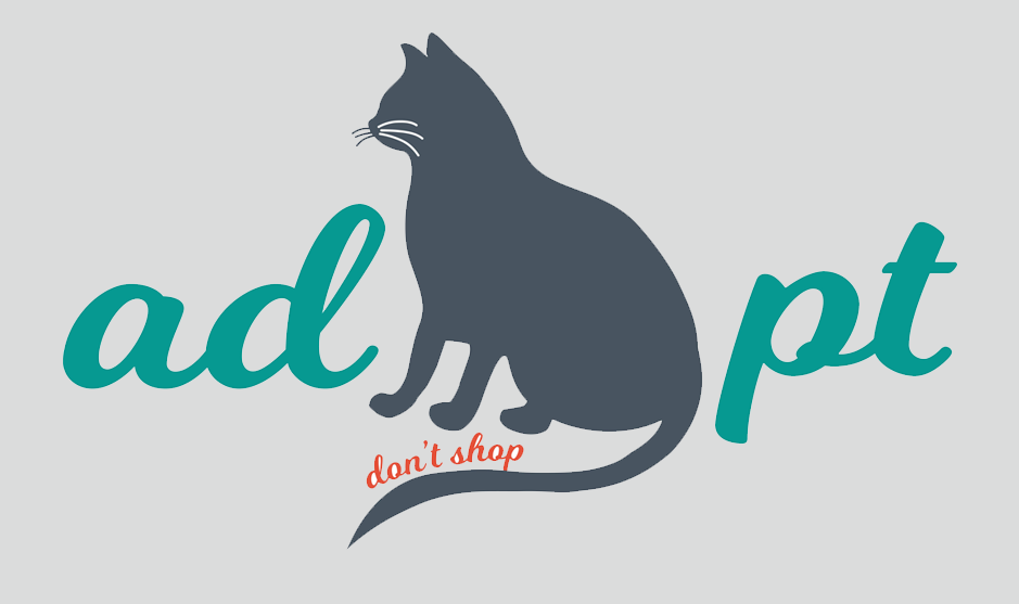
I utilized Adobe Illustrator to create my “Adopt, Don’t Shop” logo, inspired by my two rescued Siamese cats. My logo is meant to inspire people to adopt their cats, or any pet, rather than “shop” for them using a breeder, etc. This is something that I am very passionate about. I believe every animal deserves a loving home and adopting from a rescue is a great way to start. My logo is inspired by my female cat, Chardonnay, who I adopted first. The logo is meant to spell out the word "adopt", with the cat representing the "O" in "adopt" in a subtle way, since her silhouette is not identical to an "O" shape. The "don't shop" statement is meant to be incorporated as the second important part; the viewer's eye is meant to be drawn towards the adopt part, with an afterthought to the "don't shop", as a supporting statement.
Before this project, I had not created any graphic design art. I learned how to manipulate Adobe Illustrator and how to turn a concept in my head into an actual design. I learned how to make a simple logo that stands out and clearly has a message, without being too busy. This is such a great skill to have; I am pleased to be able to take what I have learned and incorporate it into my journey as an aspiring instructional designer. I used my knowledge of color theory in this project; I chose a teal color for "adopt" and an orange color for the "don't shop" area. These two colors can complement each other without being too bold. The color of the cat is meant to stand out in a more neutral way.
